
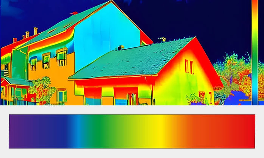
Compare the temperature legends before comparing the colours in two thermal images. A camera can map the same apparent temperature to different colours when its displayed range changes. For a Vaughan homeowner reviewing pictures of a wall, a shift from red to blue may reflect the presentation settings rather than a change in the building. The colour alone cannot establish improvement.
The colour bar supplies the missing context
A thermal image uses a palette to make differences visible. The colours are a visual language, and the legend tells you how that language is being used in the particular image. This is different from an ordinary photograph of paint. A red-looking thermal patch does not mean the wall has become red, nor does it carry one fixed temperature meaning across every camera, palette and screen capture.
Consider an intentionally simplified example. One image might display an apparent temperature range from 18 to 24 degrees Celsius, while another displays 10 to 35 degrees. A surface represented within those two ranges can receive different colours even if the measured value has not changed. These numbers are illustrative, not recommended inspection settings or acceptable building temperatures. They show why a legend cropped out of a screenshot removes information the reader needs.
A palette change adds another layer. A light colour might identify the warmer end of one palette, while another uses a different visual arrangement. Familiarity with a social-media “heat map” is not enough to interpret the camera in your hand. Read the supplied documentation and ask for an explanation of the display. Do not assume a dramatic colour has a dramatic building meaning.
When considering infrared camera rental information for Vaughan, ask which model would be supplied and whether its saved images retain the scale and information needed for your intended review. That is a more useful equipment question than asking which camera produces the brightest colours. Available file formats, analysis features and export options need confirmation for the actual unit.
Automatic scaling can change the story on screen
FLIR explains in its guidance on achieving a good thermal image that automatic mode adjusts the image’s level and span for presentation. The scale indicates the lower and upper temperatures of the current span. In practical terms, changing the scene can change how the camera distributes colours. The display may become visually different without demonstrating that the surface of interest has changed.
Imagine reviewing a wall first in a close view, then in a wider view that includes a much warmer object. The new scene gives automatic presentation a different range to accommodate. It would be misleading to treat the wall’s reduced visual prominence as proof that a suspected issue disappeared. Equally, a narrow range can make small differences look striking. Strong contrast is useful for seeing a pattern, but contrast is not a diagnosis.
The same difficulty appears in before-and-after messages. One person sends a tightly cropped picture in the morning; another sends a wide view later. Both describe the same corner, yet the views may use different ranges and palettes as well as different conditions. An owner who sees only the two colourful panels may infer a result that the files do not support. Ask for the context before accepting a caption such as “much better now.”
Consistent presentation can make comparison easier, but it does not solve every measurement problem. The operator still needs the skills appropriate to the inspection. Surface properties, viewing conditions and the question being investigated matter. A homeowner should not attempt electrical testing, open equipment or remove building finishes because a colour seems unusual. Where the finding will determine repairs, use a qualified person to interpret it and establish what further evidence is required.
It is reasonable to ask whether the operator can show two images on a comparable display scale. It is not reasonable to prescribe an arbitrary scale and assume that this creates a valid survey. The purpose of the question is to understand what you are seeing. The person conducting the work should explain both the presentation choice and the limits of comparing observations made under different circumstances.
Ask for files that preserve the comparison
Before collecting images, decide who will read them. A neighbour offering an informal opinion, a building consultant preparing a report and a contractor estimating confirmed repairs have different information needs. If the intended reviewer needs original files, confirm that before the camera is returned. A flattened image pasted into a message may be convenient, but it should not be assumed to preserve every piece of data the camera originally recorded.
Keep an unedited original and label the location clearly. If you make a cropped copy for discussion, retain the version showing the legend and the wider setting. Describe when the image was made and anything relevant that changed between observations. The note can be short: the point is to prevent a later reader from assuming that matching filenames or matching wall shapes mean matching measurement conditions.
Captions should describe observations without promoting them into conclusions. “This area appears warmer on this display” is a more limited statement than “the wall is failing.” If the image forms part of a professional assessment, preserve that person’s interpretation with its qualifications. Do not detach a striking panel from the explanation and reuse it as proof of a different claim.
Before deciding that blue is an improvement over red, put the legends side by side. If the scale, palette or conditions differ, resolve those differences with the operator. A less dramatic picture may be more useful than an impressive one when it allows the reader to understand exactly what was observed and what remains unknown.
